The Uncertain Side of Econometrics
Financial media, central bankers and even most of the economists talk about various economic parameter estimates as if they are certainties. For instance, you always hear things like “the last quarter GDP growth was at 1.2%”, “inflation is highest since 1985”, etc. In this post I look into different types of uncertainty that comes with economic estimates, namely GDP growth, unemployment rate and CPI.
GDP growth
The GDP growth number that is reported in financial media at the start of a quarter is released by the Bureau of Economic Analysis (BEA) and it is just a first estimate. It is made with about 25% of the data still missing (since the data in the service sector is not yet available). The missing data is extrapolated from the past trends. As the data continues to arrive the estimates are updated and reported as second and third estimates that are made two and three months after the initial release. It is also possible to see the most recent estimates as of today. Fixler et al. (2011) report the mean absolute revision (MAR) for annualized quarterly estimates to be 1.31 (advance), 1.29 (second) and 1.32% (third). When it comes to extreme cases Òscar Jordà et al. (2020) note that:
…fourth quarter of 2008 … initially listed at -3.8% annual rate … revised down … to an eye-watering -8.4% annual rate … had officials known the actual depth of the recession in real time, they might have voted for a larger fiscal stimulus package, for example.
They also note that:
In general, the larger the advance estimate, the smaller the revision. However, the relationship is asymmetric: negative growth rates are, on average, followed by larger revisions, in absolute value.
The data is provided by the Federal Reserve Bank of Philadelphia and we can have a look how accurate these estimates are ourselves. For instance, what is the distribution of absolute revisions when a negative first estimate is revised down even further in the most recent estimate?
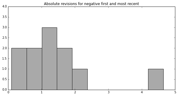
Most frequently a negative first estimate is eventually revised down by 1-1.5%. In the most extreme case it was revised down by 4.7% in 2008.
Another interesting question to explore is how many cases there are when the initial estimate was positive (economy was growing) whilst the most recent one is negative (it was actually shrinking)?
| Date | First | Second | Third | Most recent |
|---|---|---|---|---|
| 1973-07-01 | 3.546 | 3.399 | 3.399 | -2.093 |
| 1980-07-01 | 0.998 | 0.883 | 2.372 | -0.471 |
| 1982-07-01 | 0.760 | 0.000 | 0.733 | -1.526 |
| 2001-01-01 | 1.982 | 1.318 | 1.245 | -1.291 |
| 2008-01-01 | 0.597 | 0.901 | 0.959 | -1.619 |
| 2011-01-01 | 1.748 | 1.842 | 1.915 | -0.961 |
| 2011-07-01 | 2.464 | 2.004 | 1.815 | -0.154 |
| 2014-01-01 | 0.108 | -0.985 | -2.930 | -1.395 |
The above table shows that only once the second and third revisions manage to catch actual negative growth. The dates of being wrong are also noteworthy since there were recessions in 1973-1975, 1980, 1982, 2001, 2008. 2011 saw the European debt crisis.
To conclude, we can clearly see that there is uncertainty attached with not just the first, but also second and third GDP growth estimates. We can also see that the estimates are at their worst when it matters the most. This type of uncertainty due to time it takes to collect the data Manski (2014) calls transitory statistical uncertainty.
Unemployment rate
Another source of error is the so-called permanent statistical uncertainty that is created by incomplete, missing or wrong information in collected data. The unemployment rate is impacted by this because it is measured using the responses of the Current Population Survey (CPS), where a sample of households answers various questions, including the employment situation. The CPS surveys households for four consecutive months, removes them from the sampling pool for eight months, then surveys again for four consecutive months. Households have a choice not to respond during any of those eight months. When there is no response to some or all of the questions, that data is permanently lost. In order to fill in these gaps, the Census Bureau does something called hot-deck imputations. Basically, they extrapolate the missing responses based on the responses of “similar” (based on age, race, sex, etc) individuals in the sampling pool. It is not known how close these data imputations mimic the population. The document by Census Bureau (2011), notes this:
Some people refuse the interview or do not know the answers. When the entire interview is missing, other similar interviews represent the missing ones … For most missing answers, an answer from a similar household is copied. The Census Bureau does not know how close the imputed values are to the actual values.
An interesting exercise is to see the unit non-response rate (data is completely missing) over the past 20 years:
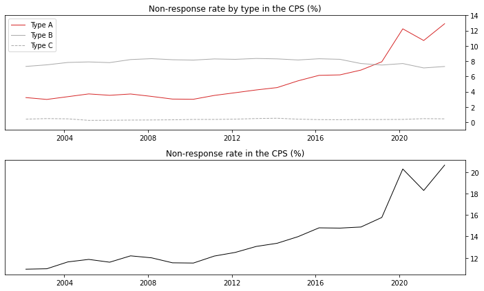
The Type A non-responses are non-interviews (e.g. no one home, language barrier, refused, etc), Type B and Type C are due to temporarily or permanently unoccupied housing units. As we can see from the chart above the Type B and Type C rates stayed the same throughout the years, however the Type A rate grew from 4% to 12%! In general the non-response rate has grown from 12% to 20% since 2010.
How much does the refusal to participate contribute to Type A non-responses?
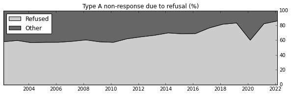
As we can see the refusal to participate completely dominates the Type A category. Analysis done by Bernhardt et al. (2021) points to the blue states and states with higher rural population as contributors to lower non-response rate. Whilst the states with lost manufacturing industries and younger population (weak correlation) tend to contribute to higher refusal rate.
We can clearly observe that the fraction of refusal to participate in the survey is growing somewhat at an exponential pace. One naive way to quantify the uncertainty that this loss of data introduces is by estimating the historic lower and upper bounds of the unemployment rate. Whilst Manski (2013) notes that these bounds are “distressingly wide”, they are however maximally credible due to no prior assumptions being imposed on them – “wide bounds reflect real uncertainty that cannot be washed away by assumptions lacking credibility”. With that in mind we can see how those bounds of uncertainty would look:
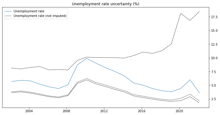
The unemployment rate in the above chart is calculated for March of every year. The blue line is the official point estimate of the unemployment rate. The gray line is the unemployment rate without missing data being extrapolated. The dashed lines are the lower and upper bounds of the estimate distribution. The lower bound is computed by assuming that the Type A non-responses are employed, whilst the upper bound assuming that they are not. The graph above should not be interpreted as if the range between 2.5% and 17.5% is some sort of confidence interval of the actual unemployment rate. Rather that whatever the distribution is, these are its bounds. Its mass could very well be centered around the currently reported unemployment rate (we just do not know that). However, what is noteworthy is that whatever the distribution is, the error of the quantity it is estimating continues to grow since 2010.
CPI
The final source of uncertainty in the economic data is the conceptual uncertainty. This type of uncertainty arises due to ambiguous or lacking definitions of something that is being measured. A good example of this type of an error is the consumer price index (CPI). If we plot the year-over-year inflation of the index, what we get looks almost like two charts glued together:
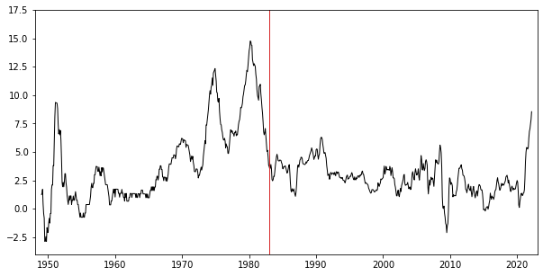
The red line in the figure above marks Jan 1983. Prior to that date the CPI included the price of “consuming” homeownership, which was based on house prices, mortgage rates, property taxes, insurance, and maintenance costs. It constituted a total of 26.1% of the index. Then the index was modified to instead track something called owner’s equivalent rent (OER), which was measured by surveying real estate owners and asking them the following question:
If someone were to rent this (including part of the property currently being used for business, farming, or render/home today) how much do you think it would rent for monthly, unfurnished and without utilities? – CEQ (2021)
At the beginning OER made only 14.5% of the index and now it is at 24.3%. The reason why this change was made was because the old CPI was mechanically attached to overnight interest rates controlled by the Fed through mortgage rates. This made fighting the inflation in the 70s and 80s like chasing your own tail. Every time the Fed would raise the interest rates the CPI would immediately follow upwards and it would artificially drop as the interest rates dropped.
The housing market related change was not the first nor the last change made to the index. The full list can be found here.
Recently Bolhouis et al. (2022) published a paper trying to backcast consumer index with OER before 1983 and all the way to 1950s in order to see how inflation would have looked back then if it used owner’s equivalent rent all along:
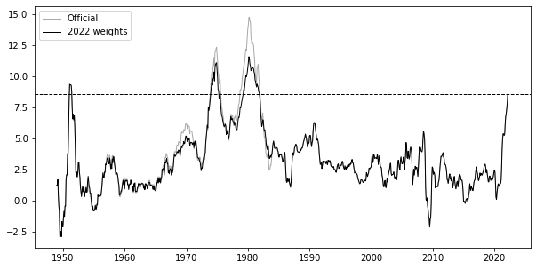
The way the corrected version was generated was by taking rent inflation and using that instead of shelter prior to 1983. There is a problem with this backcast since the Fed officials did not see the “corrected” chart, therefore in a parallel universe where OER was used from the start, the rent inflation might have looked a lot different, making decisions different and thus future different. In any case, I think the adjusted version does succeed showign potential inaccuracies hidden in the official chart.
Bolhouis et al. (2022) have also backcasted CPI using weights from different periods, for instance here is one using the most recent weights:
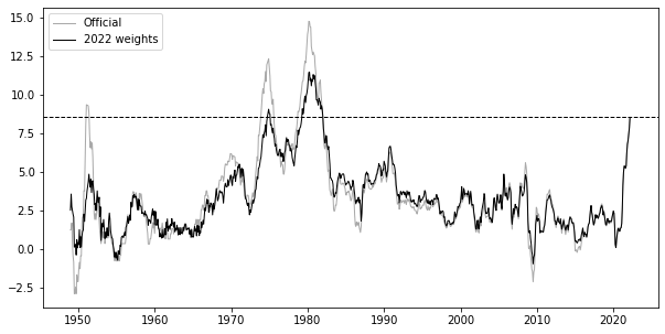
The paper has also mentioned some examples of potential pitfalls when trying to compare current inflation with different historic periods using the official chart:
…in arguing against policy makers falling “behind the curve” in the face of rising inflation, Blanchard (2022) showed that today’s gap between core inflation – which removes volatile food and energy prices – and real interest rates is approaching about 70 percent of the 1975 gap. We argue against using official CPI inflation to assess this gap… pre-1983 peak CPI inflation measures, especially during the Volcker-era, [were] artificially high at the beginning of the tightening cycle, and declines look artificially fast. …Recent work suggests that the years following World War II have strong similarities to the current inflation environment (e.g. Rouse et al., 2021; DeLong, 2022). We show that due to the greater weight of transitory goods components – especially food and apparel – in the index of the 1940s and 1950s, past inflation spikes were higher and more short-lived than today’s.
Conclusion
As I was looking into this, it sort of started to make sense why people do not like to impose confidence intervals when it comes to economic data. Given the size of the uncertainty, nobody would be able to neither make decisions, nor build narratives around the data. It is almost as if “it does not matter if it is right or wrong, just give me a number to work with”.
References
- Bernhardt, R., Munro, D., & Wolcott, E. (2021). How Does the Dramatic Rise of CPS Non-Response Impact Labor Market Indicators? (No. 781). GLO Discussion Paper.
- Bolhuis, M. A., Cramer, J. N., & Summers, L. H. (2022). Comparing Past and Present Inflation (No. w30116). National Bureau of Economic Research.
- Consumer Expenditure Surveys Interview Questionnaire (CEQ) (2021), p116
- Fixler, D. J., Greenaway-McGrevy, R., & Grimm, B. T. (2011). Revisions to GDP, GDI, and their major components. Survey of Current Business, 91(7), 9-31.
- Manski (2014), Credible Interval Estimates For Official Statistics With Survey Nonresponse
- Manski (2013), Communicating Uncertainty In Official Economic Statistics
- Òscar Jordà et al. (2020), The Fog of Numbers, https://www.frbsf.org/economic-research/publications/economic-letter/2020/july/fog-of-numbers-gdp-revisions/.
- U.S. Census Bureau (2011), Current Housing Reports, Series H150/09, American Housing Survey for the United States: 2009, Washington, DC: U.S. Government Office.